Building My Portfolio with Vibes: A Meta-Experiment
Testing just how far AI design and coding tools have come
So meta...
Experiment Snapshot
Completed
~40 hours
Explore "Vibe-Design" methodology with AI tools
v0.dev, Claude Code, Figma Make, Next.js
Testing cutting-edge AI design and coding tools
The One-Liner
I built my portfolio site entirely through "vibe-based" AI design and coding to test just how far these tools have come, and learned exactly when to trust the robots and when to take the wheel.
What I Wanted to Learn
I've been curious about the current state of AI-powered design and development tools. You know, the ones that promise to turn your rambling descriptions into beautiful, functional websites. But curiosity without action is just daydreaming, so I decided to build something real: my own portfolio site.
Why a portfolio? Well, it's the perfect low-stakes project with actual stakes. Low-stakes because it's just for me. Actual stakes because, let's be honest, I want to look good. Plus, a personal portfolio is complex enough to really push these tools: it needs personality, technical sophistication, and that ineffable "vibe" that makes people want to work with you.
My main questions: What are these AI tools actually good at? Where do they fall short? And most importantly, when should I let them drive versus grabbing the wheel myself?
What I Built
The Arsenal
- Loveable - The promising contender
- v0.dev - Vercel's offering
- Figma Make - The design-first approach
- Orchids.app (YC W25) - The newcomer
- Claude Code - The terminal wizard
- VS Code - To keep an eye on things
Time invested: 40+ hours (including many delightful rabbit holes)
Tech stack: Next.js, Tailwind CSS, Shadcn UI
The Journey
Finding My Voice
First things first: who am I online? I could've built a site for my S-corp, complete with phantom employees and corporate speak. But that felt like wearing a suit to a coffee shop. Instead, I chose authenticity: just me, an independent contractor who loves building things.
The Great Prompt-Off
With Claude and ChatGPT as my writing partners, I crafted the perfect initial prompt. No screenshots of other portfolios, no "make it look like X." I wanted to see what these tools would dream up from scratch.
Create a modern, minimalist portfolio website for a technical product manager consultant specializing in custom software development, leading discovery and design sprints, and business process automation.
The design should be clean and sophisticated - as if crafted by a professional designer - but without ornate elements or unnecessary embellishments.
The design should also focus on creating a site for me personally, not a company or a product. It should be personal. I want people to feel like I am talented, capable, and fun to work with.
ROLE & PURPOSE:
I'm a technical product manager who helps clients discover, design, and implement custom software solutions and internal process automation. The website's primary goal is to attract potential clients and demonstrate my expertise in transforming business challenges into technical solutions.
DESIGN REQUIREMENTS:
- Clean, modern aesthetic with plenty of white space
- Professional color scheme (suggest a palette with subtle accent colors)
- Typography that conveys expertise and approachability
- Responsive design that works perfectly on all devices
- Strategic use of photos and illustrations where they enhance the message
- Fast loading times and smooth scrolling experience
- Subtle bright Pacific Northwest vibe: Bright accent colors, subtle gradients, or other subtle ways to convey a sumertime PNW vibe while maintaining a modern aesthetic.
PERSONALITY: I am a playful person. I like golf, pickleball, and snowboarding. I am a new dad of a baby girl.
I would love to see how you could add a touch of personality to this site while still maintaining a professional tone. I want people to know that I am an intelligent and capable individual who is both enjoyable to be around and great to work with.
SITE STRUCTURE:
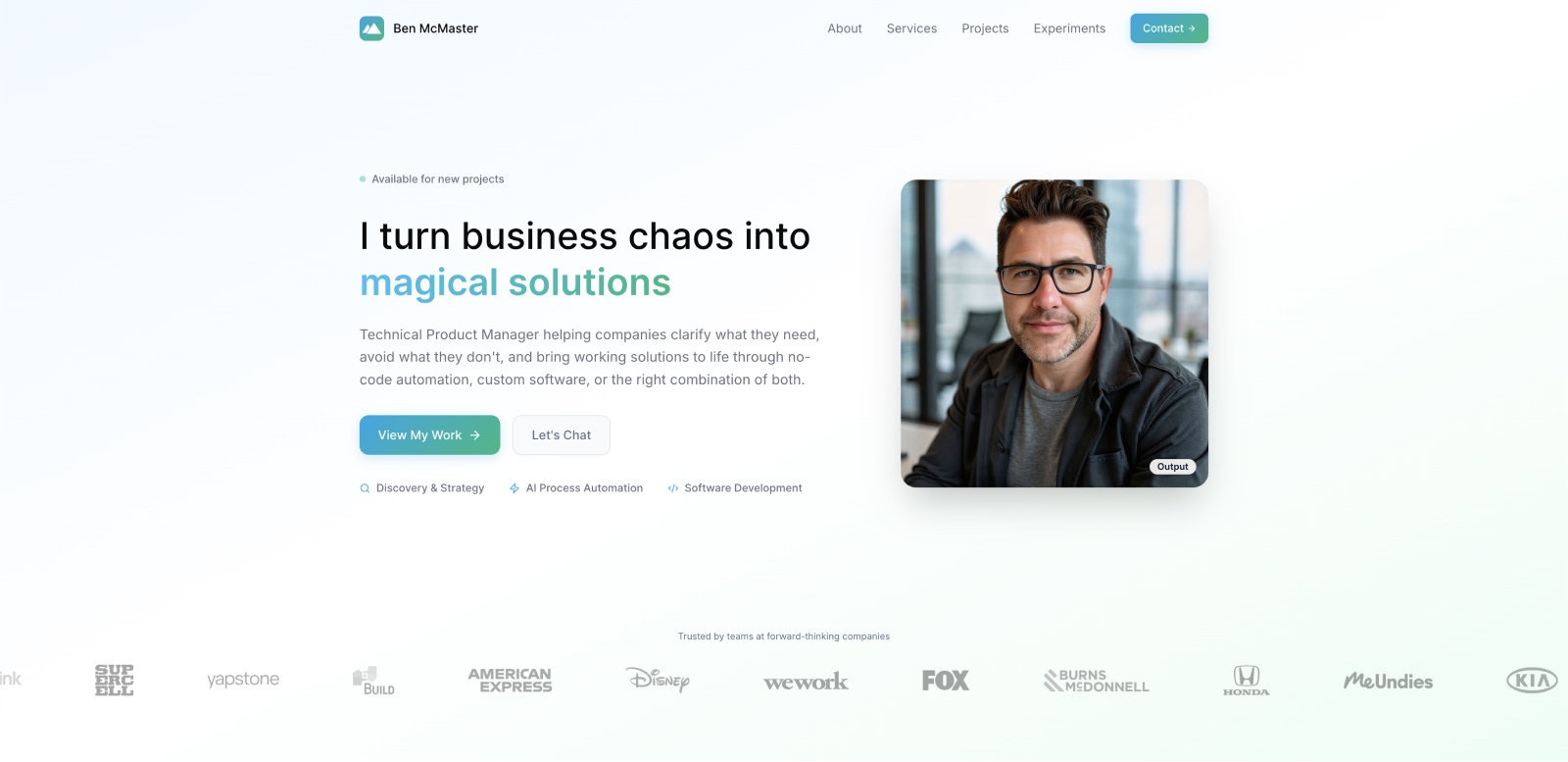
Homepage: A scrolling landing page with a hero section, About Me section, Services Section, Professional Projects Section, Experiments Section, and a Contact Section.
- Hero: A great title and subtitle with a couple of calls to action: View my work (scrolls to projects), and Let's chat (scrolls to contact). Also add a headshot of me!
- About Me: Short, summarized professional journey and my current strengths: Started as a front-end developer and designer, co-founded a wellness tech startup, sold the startup, became a product manager, now I consult for startups and enterprises. I would also like to see a tiny subsection that mentions my life outside of work. Add a button to link to a full About Me page.
- Services: Discovery, Strategy, and Planning. No-code AI Process Automation. Custom Software development.
- Professional Projects: This is a preview of my professional projects. This section should show 3 cards for selected case studies. A button will link to a page listing all projects.
- Experiments: This section shows my various projects to teach myself new technology. At launch, this site will only have one experiment. I want the look of this section to be different from that of the Professional Projects.
- Contact: This section will have two cards: email me and connect on LinkedIn.
Top Navigation: A top navigation and a footer will be included. This will include smooth scrolling links to all sections of the homepage. It will also include my name, "Ben McMaster" and a small logo. Clicking on the logo or my name will link to the home page. Footer: A footer will be present at the bottom of all pages. This will include quick links to all sections of the homepage, including a "Home" link that allows users to return to the homepage from subpages. The footer will contain quick contact details, including email and LinkedIn.
CONTENT FOCUS:
- Emphasize problem-solving capabilities and technical expertise
- Showcase measurable business impact from past projects
- Demonstrate versatility across different industries and technologies
- Include subtle trust signals like client testimonials or company logos
- Professional tone that balances technical competence with accessibility
TECHNICAL REQUIREMENTS:
- Implement smooth animations and micro-interactions
- Must look beautiful across mobile, tablet, and desktop devices.
Please start with the homepage layout and overall site architecture, then we can refine individual sections and subpages.Create a modern, minimalist portfolio website for a technical product manager consultant specializing in custom software...
The Beauty Contest
Each tool got the same prompt. The results?
- Figma Make impressed me. The designs were clean, modern, interactive, and actually looked like something a legit designer would create.
- Loveable came in a respectable second: simple, effective, but missing that special something.
- Orchids.app was fine. Just fine. Though I did appreciate that it defaulted to Next.js.
- v0.dev... well, it looked exactly like what happens when developers design things. I couldn't even look at it. (Sorry, Vercel.)
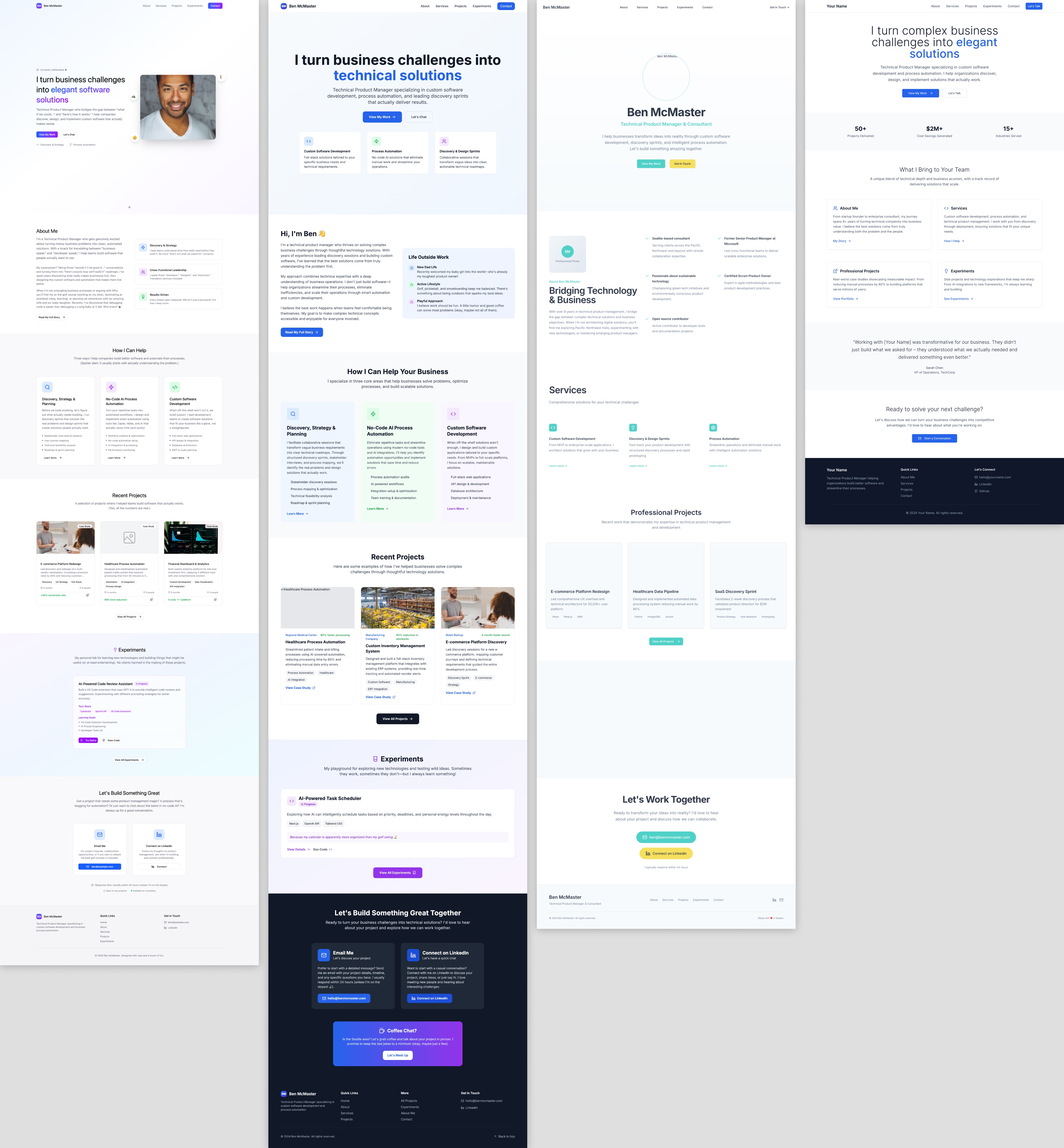
Side-by-side comparison of AI-generated designs: Figma, Lovable, Orchids, v0
The Infrastructure Headache
Here's where things got interesting. Figma Make created beautiful designs but had the infrastructure knowledge of a goldfish. Despite using Claude Sonnet 4 under the hood, it refused to build a proper Next.js site. It wouldn't even use React Router. My attempts to coax it into Next.js compliance resulted in a spectacular mess.
Enter Claude Code, my supposed savior. Could it transform Figma Make's beautiful creation into a proper Next.js app? Nope. Turns out Figma Make's internal build process and Tailwind usage were so unique that even Claude Code threw up its hands in defeat.
The Plot Twist
Stuck between beautiful design and broken infrastructure, I asked Claude Code for advice. Its suggestion? Start fresh with v0.dev. Of course: v0 is from Vercel, the creators of Next.js. It speaks Next.js natively.
The Great Migration
Here's where v0.dev surprised me: it has this clever feature where you can upload screenshots and it recreates them. Plus, Figma Make (bless its heart) generated comprehensive design documentation when I asked for a Design System markdown file. Armed with screenshots and detailed design tokens, v0 recreated my site section by section with near-perfect accuracy.
Feature Creep and Reality Checks
Feeling confident, I tried adding a client logo ticker. v0.dev failed spectacularly. It couldn't figure out seamless looping to save its life. I knew exactly what was wrong, but I wanted to see if it could figure it out. It couldn't.
Claude Code, however, nailed it in just a couple of iterations. This became my pattern: v0 for the foundation, Claude Code for the finesse.
Mobile Mayhem
You know that moment when you finally check your site on mobile? Yeah, it was a disaster. But Claude Code turned into a methodical debugging machine, systematically checking each breakpoint and understanding design considerations. Using Chrome DevTools' device presets, we slowly but surely made it responsive.
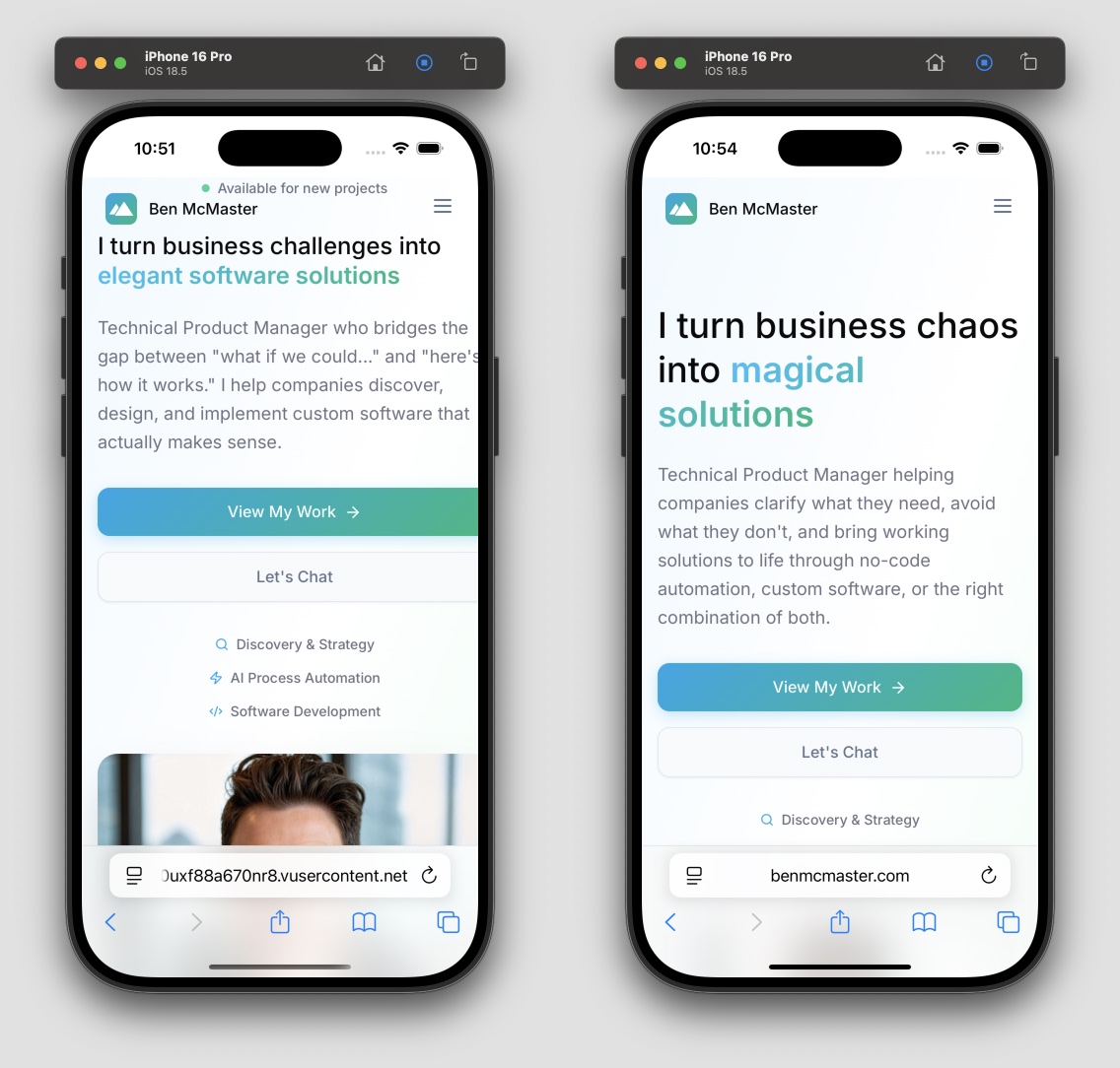
Before-and-after mobile optimization screenshots
The Content Archaeology
With the technical foundation solid, I dove into my past to excavate project content. Twenty years, 30+ projects, and apparently zero archival instincts. When a project ends, I'm already thinking about the next one. After mining old computers and pestering former colleagues, I managed to gather enough screenshots and data to tell my story.
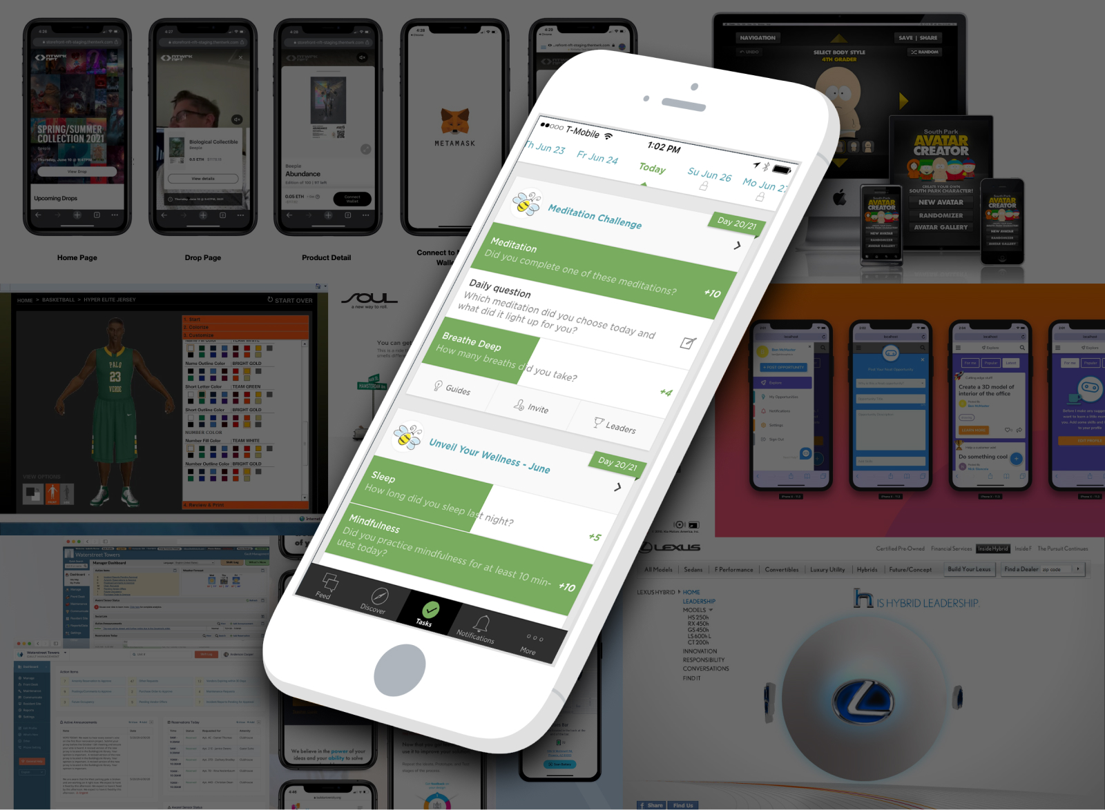
Screenshot collage of gathered project visuals
What I Learned
The Good
- Claude Code exceeded expectations. Working directly in the terminal felt natural, like having a very smart pair programmer who never judges your messy codebase.
- Vibe-based design is real, but it's still subjective and requires expert prompting and patience.
- Tool specialization matters. Each tool has its sweet spot. Respect it.
The Surprising
Claude Code isn't just for coding. Point it at local files and it becomes a Swiss Army knife. It downloaded images from S3, optimized them, and reorganized my project structure. When I asked for advice, it knew when to educate versus when to take action. That's rare.
My 3-Terminal Setup: Upper left: my dev server, Lower Left: git, lint, misc, Right: Claude Code
The Frustrating
- Claude sometimes forgets DRY principles. It would inline styles on every list item instead of creating a reusable class. Or create identical folder structures for each project instead of using a template. (Though it always thanked me when I pointed this out, which was oddly endearing.)
- v0's chat is overeager. Ask a simple question, get unwanted code changes. Sometimes I just want to talk, v0!
- All the designs felt a bit dated. Card-based layouts everywhere. Maybe bleeding-edge design is impossible when you're trained on yesterday's internet.
- Asset creation remains painful. Without Photoshop, I bounced between Figma and PhotoPea. Figma's AI features were frustrating. Ask it to remove a background, and it somehow alters the image itself.
The Logo Saga
I needed a personal logo. ChatGPT's image generation and Canva's AI tools produced things that were simultaneously too complicated and too generic. In the end? I went with a simple mountain icon that looks like a 'B' on its side (and also an 'M' if you squint). Sometimes simple wins.
Next Steps
The site works, but there's more to explore:
- Search and filter functionality for my 30+ projects. Tags for industry, technology, and service type could make browsing actually useful.
- Dark mode toggle. I wonder if Claude Code could nail this in one shot?
The Bottom Line
AI tools have come incredibly far, but they're instruments, not orchestras. The magic happens when you know which tool to use when, and more importantly, when to step in yourself. My portfolio exists because I let Figma Make handle the vibes, v0.dev handle the structure, and Claude Code handle the details, with me conducting the whole symphony.
🏷 Tags
Interested in AI-Driven Development?
I love experimenting with cutting-edge tools and methodologies. Let's discuss how AI can transform your development workflow or design process.